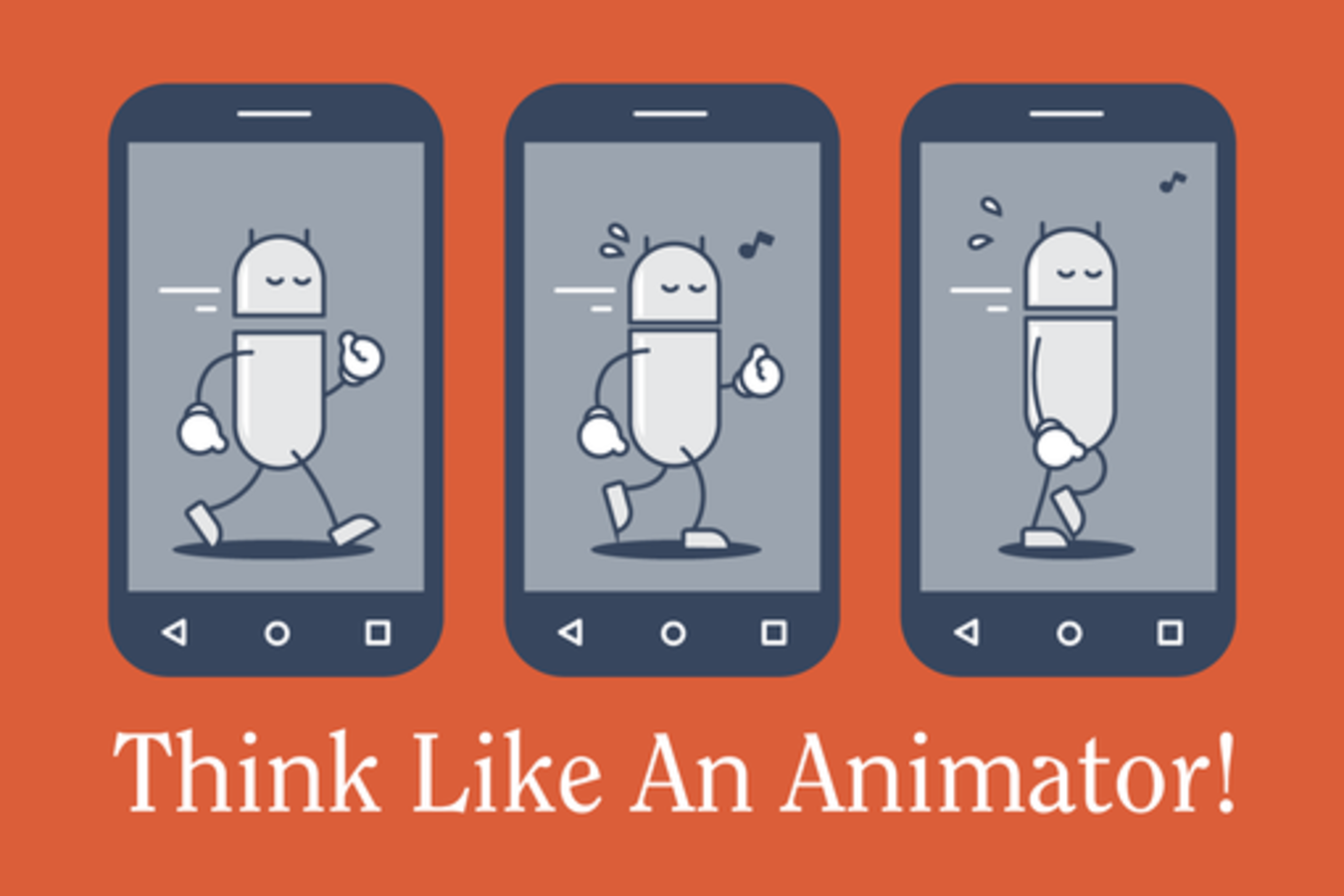
Think Like an Animator: Motion on Android

Android interfaces are utilitarian to a fault. Due to a variety of issues, Android’s design is typically left in the wayside to its iOS brethren, leaving the unsuspecting Android developer to their own discretion in bringing a product to life in a different ecosystem.
Interfaces jump and pop around, flickering in and out on linear paths with little regard to a feeling of consistency or purpose. List views slam gracelessly into walls. Transitions between screens are chunky, aimless zooms. Even much of the much-touted “Material design” is clunky. It makes otherwise useful and nice looking apps feel confusing and second rate.
That means more confusion and less engagement among your users.
The solution: Android engineers need to become animators. We cover basic principles of Animation, how these can be applied to the Android platform, and how to work with designers (or on your own) to mock them up.
Presenters
Kevin Grant
Android Engineer
Tumblr
KEVIN GRANT is an Android Engineer at tumblr, a creative blogging platform in New York City, where he focuses on application design, implementing the latest design and user interaction paradigms an...
Show the restZack Sultan
Lead Designer
Tumblr
Zack Sultan works at Tumblr, where he designs such applications as Tumblr for Android and Tumblr.com: The Website. Occasionally, he makes logos and icons. Previously, he worked for agencies large a...
Show the rest


